There are some cases where you'll want to show some elements only under certain conditions.
You might find the 'Show' and 'Hide' functions in workflows helpful, but there are a few other ways. For example, a checkmark icon when you submit a form. A field that appears when you click a specific button.
Methods to show and hide elements in Bubble?
As with everything in Bubble, there are various ways to achieve a thing. Each method has pros and cons, and not every solution will work for every use case.
- Use the 'Show' and 'Hide' actions in the workflows.
- Use the 'Toggle' action.
- Use animations.
- Use custom states.
- Use URL parameters.
The most flexible and preferred methods of the above are custom states and URL parameters. We will cover custom states in this tutorial and skip the URL parameters to keep the tutorial concise.
How to show and hide elements in Bubble?
- Create a custom state of type Yes/No.
- Assign a default value to the custom state.
- Make the elements hidden on page load.
- Make the elements collapsible when hidden.
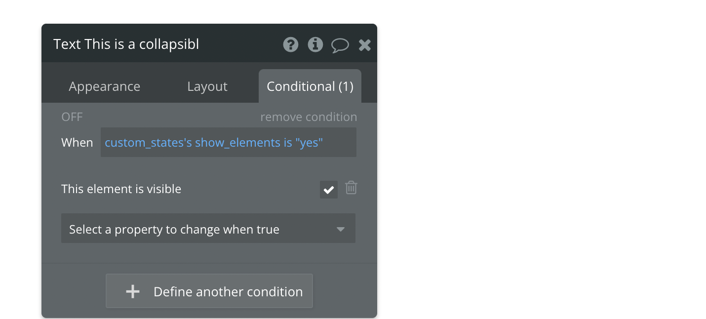
- Create a condition on the element to define when the element should be visible.
- Use a workflow to update the custom state.
What are custom states in Bubble?
Custom states are temporary values stored in the user's browser. They are unique for each user and are lost when you refresh or reload the page.
They can have a default value, and because their value is restored, they are handy for page navigation.
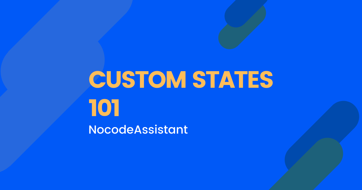
How to create a custom state in Bubble?
Select any element on your page where you want to store the custom state. You can keep the custom state on the page or any other element. It doesn't make much of a difference.
- Click the small 'i' icon in the top corner when you open the element's properties.
- Click on 'Add a new custom state'.
- Give your custom state a name and a type of content.
- Assign a default value. I've given a default value of No.
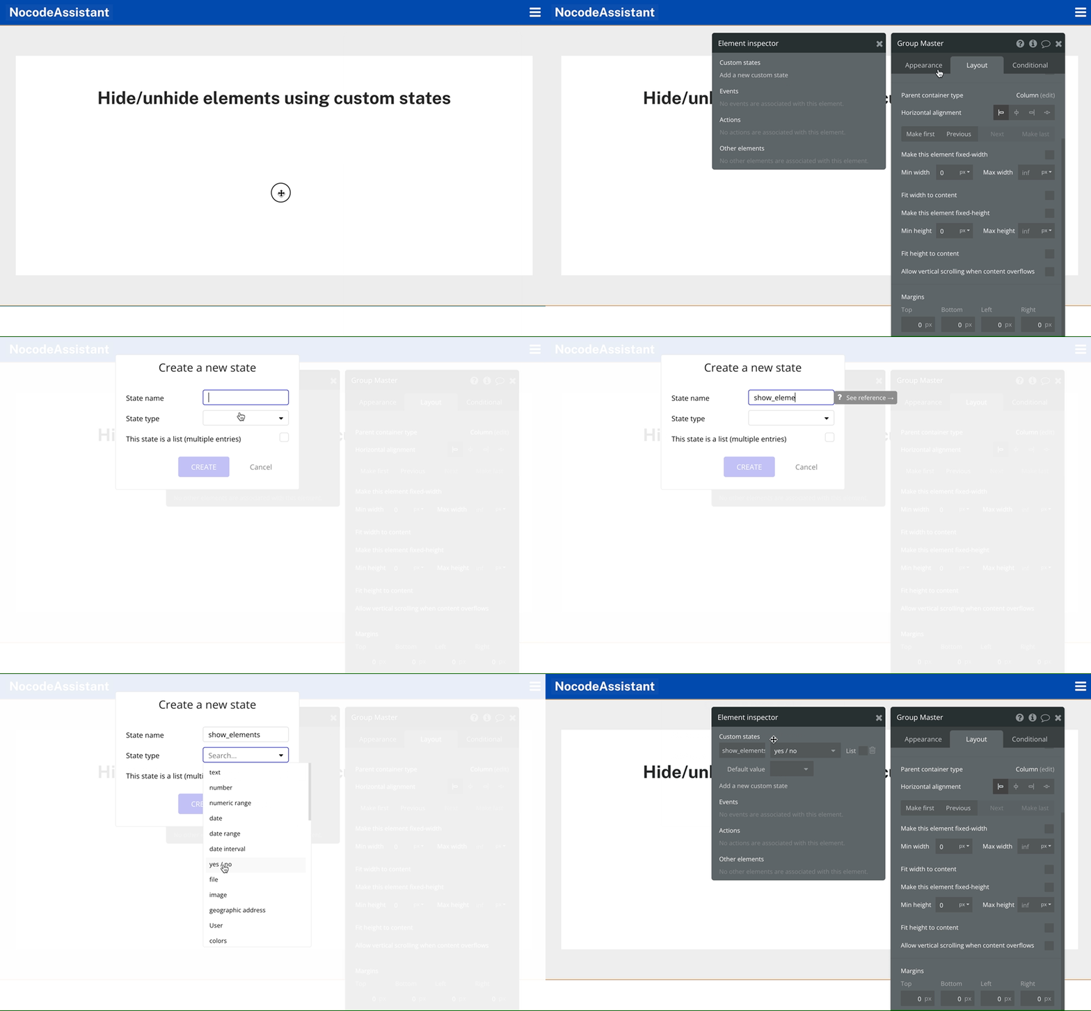
Setting up the collapsible elements
We'll need to make a few changes to the elements shown conditionally.
- Change the visibility of the elements.
- Set them to collapse when hidden.
A common mistake is to have the elements visible on page load and hidden only under certain conditions.This works but has a minor UX issue.
You have a button that should only be visible when the current user is logged in.If a user is logged out, the button will flash on their screen and then be removed.What made the button flash?
Bubble waits to check conditions until a page is loaded.And because the button is visible by default, Bubble will make the button visible and hide it after a split second.
This makes the button flash on the screen.
To prevent this, I recommend that you hide such elements on page load. And only make them visible when the conditions are met.
The second mistake is not having the collapsible groups collapse their height and width. If the checkbox is checked, Bubble will use up the height and width occupied by the elements.
And the user will not notice any strange space.
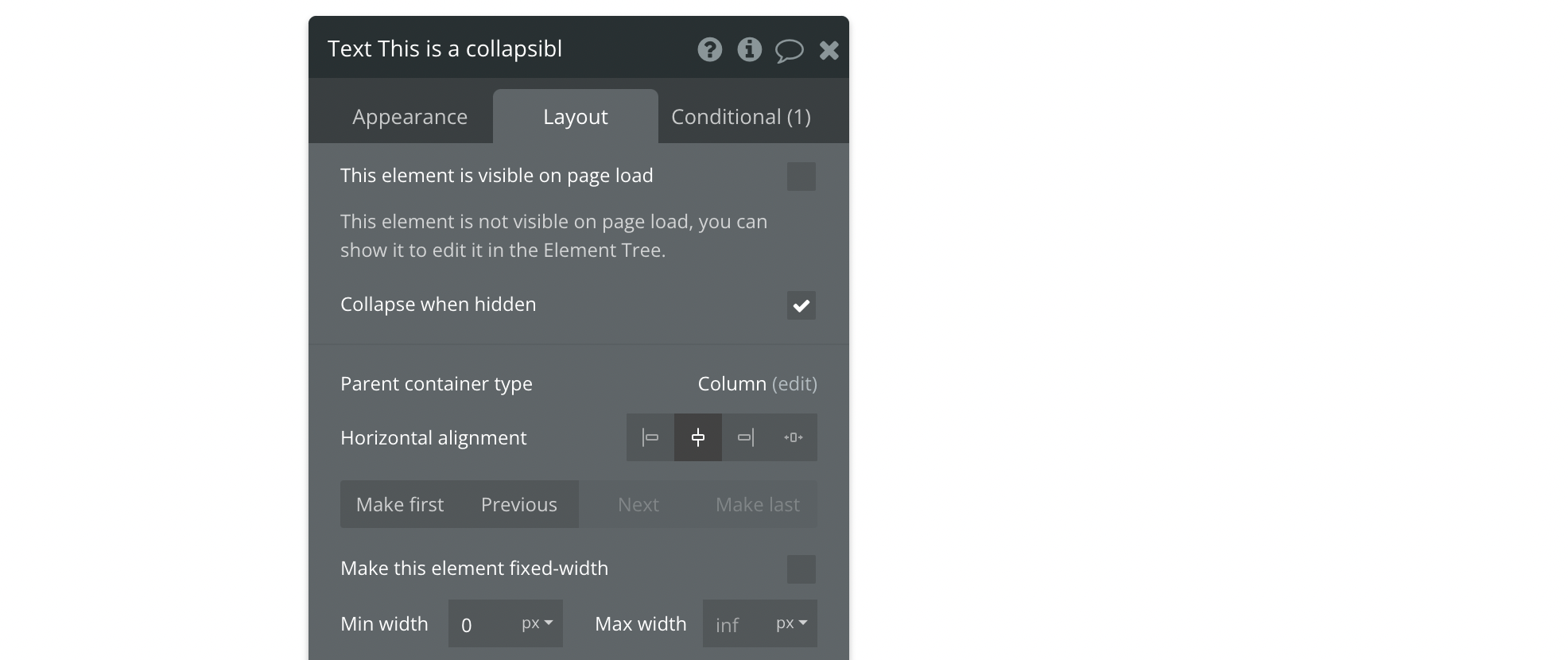
How to show and hide an element?
We have two steps left after creating the custom state and configuring the element.
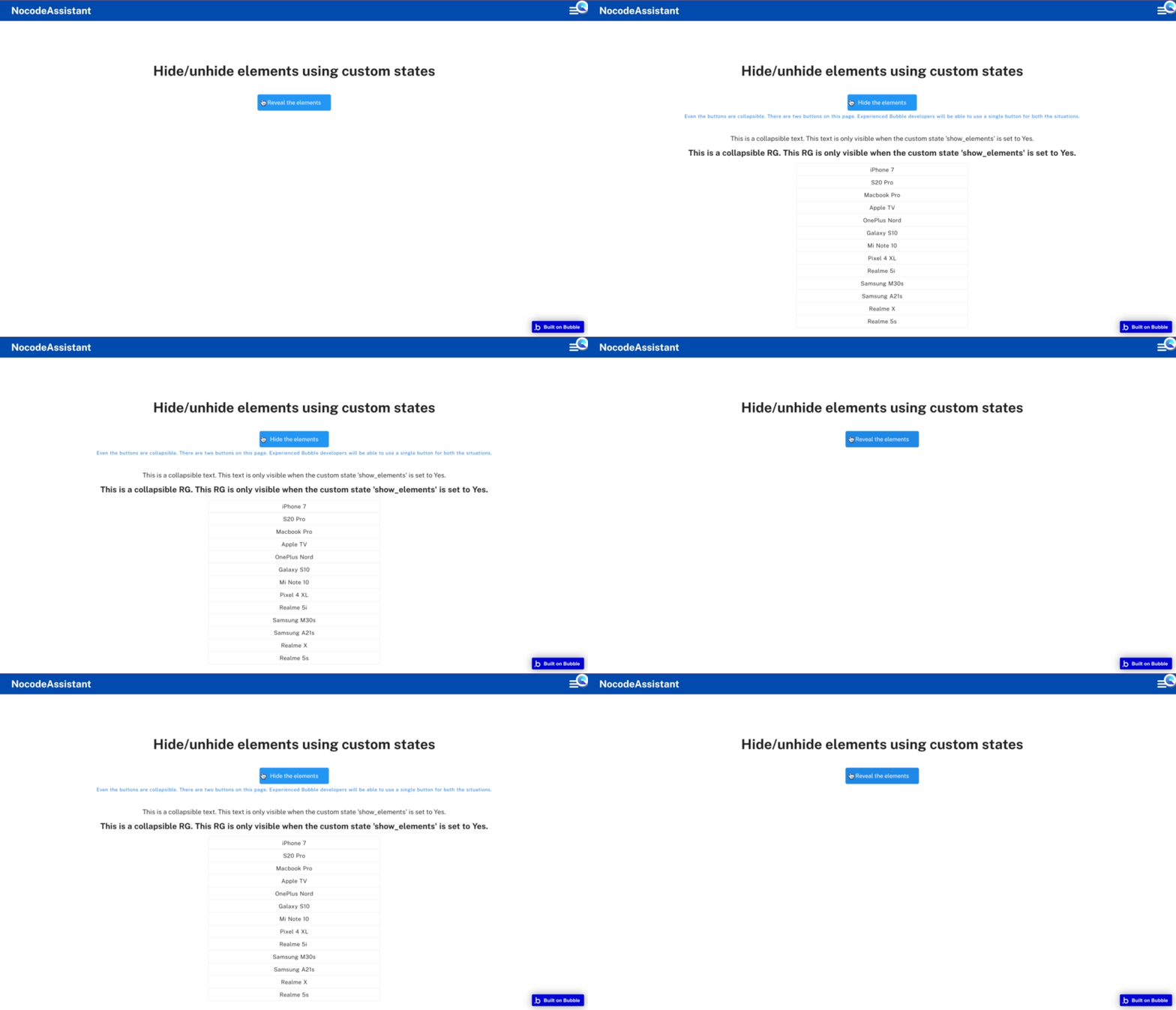
Step 1: Use a workflow to update the custom state. This will change the custom state value and toggle the visibility of the elements.
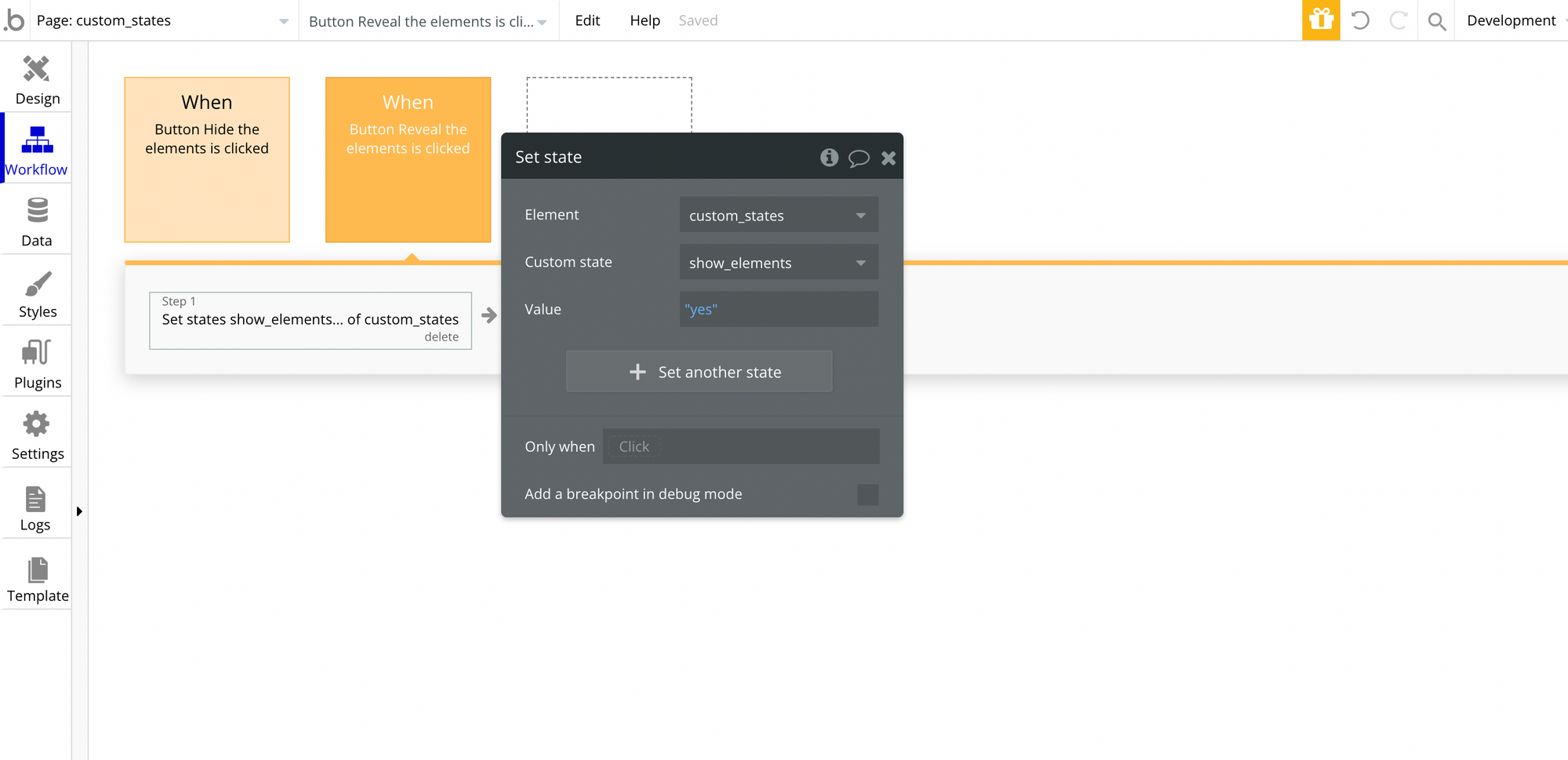
Step 2: Create a condition on the element to define when the element should be visible. This condition will check the custom state value.
Final result

Preview - https://nocodeassistant-tutorials.bubbleapps.io/version-test/custom_states
Editor - https://bubble.io/page?type=page&name=custom_states&id=nocodeassistant-tutorials&tab=tabs-1
If you need some help with your Bubble app or a team of Bubble developers to build a Bubble app for you, reach out to me at [email protected]. You can also follow me on Twitter.




Join the conversation.